Originally, Fluid UI was conceived of as a mobile prototyping tool, but one of the things we’ve learned over the years is that people don’t need mobile as much as they want a single tool that allows them to design for whatever platform they need for their current project. “One tool to rule them all” so to speak.
Since then, we’ve updated the libraries to allow for more flexibility but one area that needed an overhaul was the preview - and thankfully now that is done with this release. So without further ado…
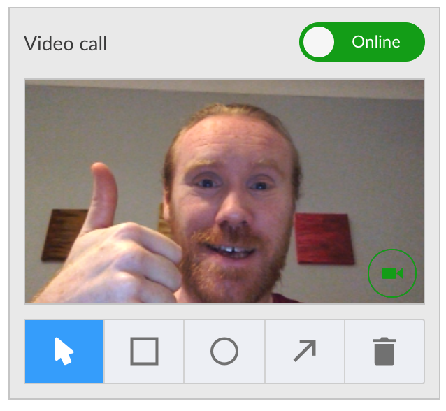
Bigger video calling!

- Communicating ideas and getting feedback in user tests just got a lot easier with the larger video size.
- Click on users to focus on them so you can watch their thoughts as they click through your prototypes.
New preview options for desktop previews
The biggest problem with preview until now has been that it was really focused on mobile only - no more!
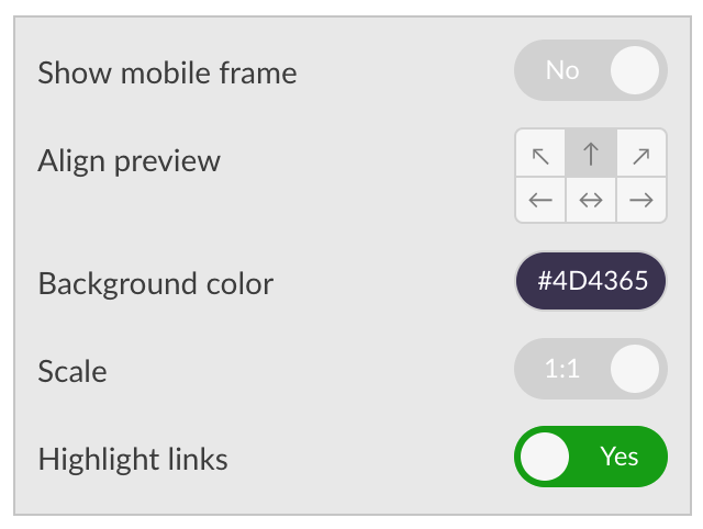
- Ability to toggle the mobile frame on/off.
- Ability to align the preview to the top / left / bottom / center etc. Mobile apps will most often be center aligned with frame on, desktop apps now have the option to be top aligned which will make them more realistic.
- Ability to set the background color of the page - now you can match the background color with part of the project, making your desktop project merge perfectly into the background.

All of these features work seamlessly and in real time with all collaborators and reviewers that are online at the same time, so be prepared to blow people away as you update your projects in real time.
All in all, Fluid UI can now show desktop projects with equal levels of immersion as mobile ones. But wait, there’s more!
Reviewer permissions
Another area we get a lot of feedback on is the ability to toggle what permissions reviewers have when accessing your project. We’ve added some new project level permissions so you can dictate what can and can’t be seen

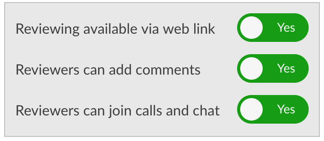
- Ability to toggle whether a project can be reviewed (by the reviewer link below) at all. Turning this option to NO this will mean the project can only be previewed when you are logged in to your account or a team member’s account that the project is shared with.
- Ability to enable/disable posting of comments in the preview
- Ability to enable/disable the video calling features.
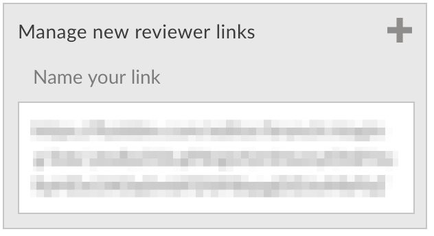
We’ve also had plenty of feedback about people wanting to be able to share different links to the same project with different user groups - e.g. one link for developers or subcontractors and a separate link for clients in order to make sure they don’t come in contact with each other.
- Added the ability to create additional project links that are unique and can be added / deleted / named - e.g. “Developer link”

Right now, these links don’t have comments or calling enabled (separating out comments and calls on the same project to different links gets…messy), but if it’s an important feature to you, please let us know in the chat!
And finally…

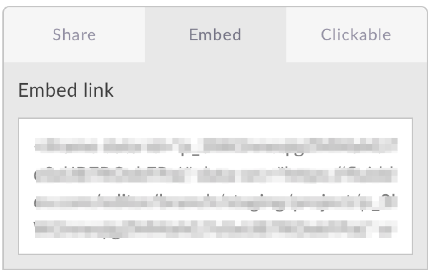
- Added a link to embed the project - often people look to use an iframe (youtube style) to embed a prototype link in another tool or website (Jira, github etc).
- Also added an easy copyable link to the “project only” url (with none of the Fluid UI chrome around it).

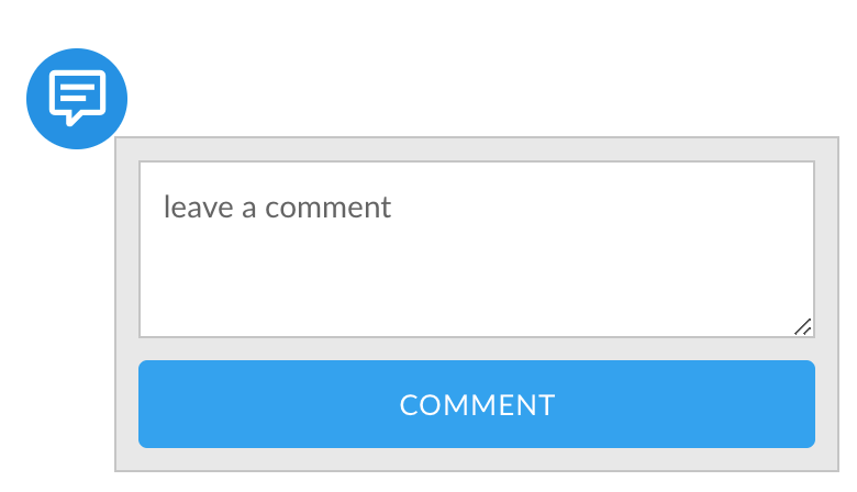
- We’ve dramatically tidied up comments, made them sexier looking and easier to use. Of particular note, comments are now threaded better and the actually placing of comments is done inline rather than in the side panel, saving a good bit of time.
- Clicking on a comment in the side bar will zoom into the page where that comment is located in the project, saving a bit more time.
Definitely finally this time!
- We’ve added the ability to totally close the library in preview, allowing you to play with your prototype with nothing else getting in the way.
- Removed the need for reviewers to sign up before previewing (sorry, this was a miscommunicated requirement before - it was needed for users to make comments, but should not be needed for preview. We’ve moved it back to where it makes sense).
- Improved how the 1:1 and Fit scaling functionality works - 1:1 is now always a pixel perfect zoom level, while “Fit always draws the project as large as possible given the size of the window.
Ok, that’s it for now - our next two big releases all relate to the library and widgets and will be out in April/May - stay tuned!
Dave
