When designing a product, graphical glitches and other “minor” design issues are often hard to justify fixing when competing for resources against higher priority bugfixes and even features releases.
The problem with not fixing them is that they build up, and two, three or four minor issues can easily affect the overall experience as badly as other more serious issues.
Part 1 of this release is all about fixing a lot of small UI artefacts that - when combined - cause the overall experience to suffer. We hope you love using Fluid UI more as a result!
Part 2 is the first of a number of releases intended to improve the look and feel of the product by standardising many of the menus and styles - increasing learnability, improving performance by eliminating redundant code and giving a more pleasant overall editing experience.
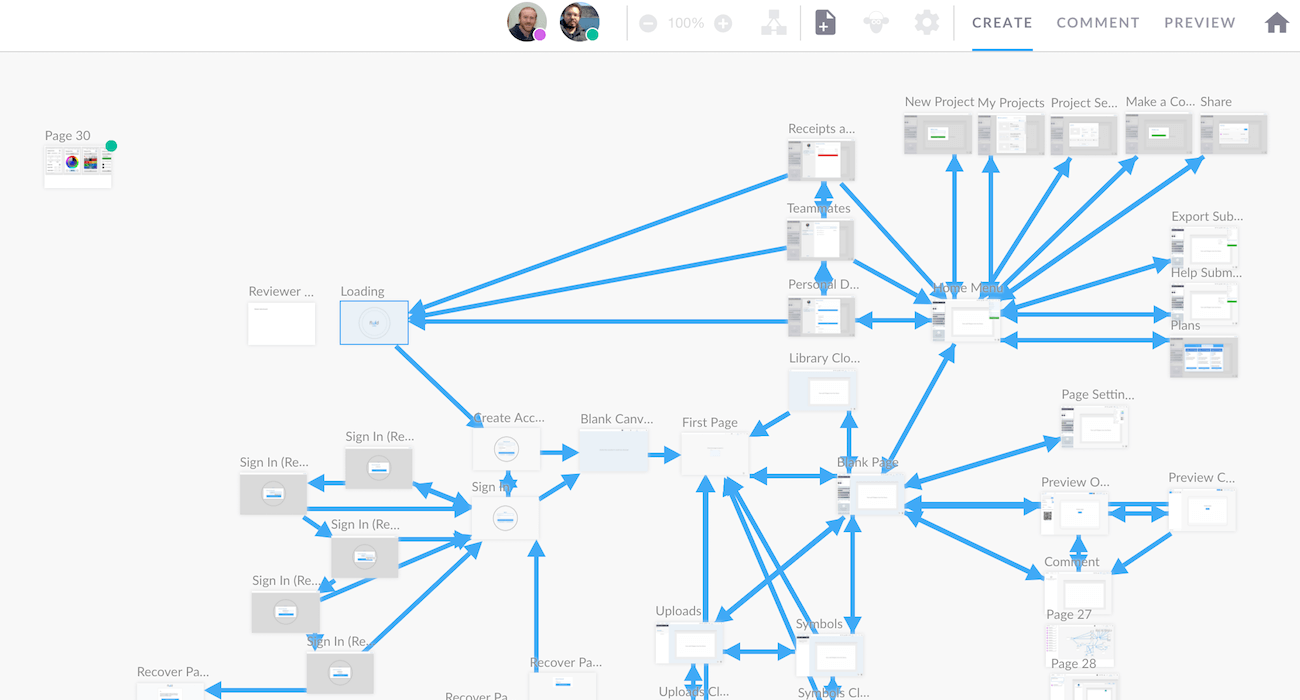
First up - the projects menu is now far more accessible especially for users with a large number of projects. We’ve also gone through the signup, sign in and recover password flows, setting standards that will be rolled out across the editor

Happy creating!
Dave
Graphical / Rendering Fixes